Notice anything different around here? Yes?!
YES! I am so excited to share my new site with you. Isn’t it great? I can’t wait to tell you all about this and how it came about.
I was inspired after attending the International Food Blogging conference to think about branding my blog. Up until this point I never had a logo!
When I started this blog years ago, I didn’t think about that being important. I guess I spent less money on my original blog design back then versus having a logo created and it’s been fine for the past few years, but it was time for a change. Plus I wanted to be able to print things with my “nutritious eats” logo and I didn’t have any rights to do that before per my original blog designer.
Not just that, but my old blog theme had a lot of glitches so I was in need of a whole new platform (more on that).
So back to the logo- I knew I wanted to keep the olive brach because I’ve always loved it. I’ve got Brazilian blood from my born and raised Brazilian father, and Greek blood from my mom’s side. I love the Mediterranean diet and stand behind the health benefits of olives and olive oil. I also thought it would be nice to keep that one thing constant. I challenged Julie from Deluxe Designs to create a fabulous, fresh new logo for my site. She is amazing by the way!
The header
So this was my old design that technically was not a “logo”

I also got rid of the pictures as I felt like the whole look was a little outdated. Don’t get me wrong, I’ve always liked my site, but the photos were stock photos, not mine. I just wanted a clean fresh new look so we wiped out the whole header.

and these are some of the initial designs Julie sent me on the logo

I wan’t sure exactly how I wanted it to look, but I knew the branch wasn’t quite right in this set. I didn’t think anyone would be able to tell what it was. It was a good starting place and helped us figure out font and color.
Then this set came which I really liked too. The color in the top was too light though so I decided to keep the darker font.
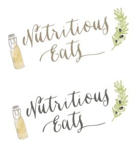
but I asked a few family members for their opinion and this logo was the winner! Love it!
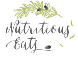
The tagline
Oh the tagline. So hard to define your blog in a few words. Many sites don’t even have them, which is totally fine. I wanted to keep mine, but shorten it and make it a little more fun.
So it went from
delicious recipes, healthy ingredients, expert advice
to
tasty bites, healthy lives
Big thanks to my husband and sister-in-law Kim for coming up with it!
The format
I’ve disliked my theme for a long time (for those non-bloggers the theme is basically the structure of your blog). Certain things are set within the coding of a certain theme like the way the home page displays your posts- my previous theme displayed 2 full posts then excerpts, the font is set (which I’ve never really liked) and other functionalities of the blog .
I knew I needed a more advanced theme that was more user friendly for me and easier for you all to find stuff. Julie recommended the Foodie Pro theme which is a common theme amongst food bloggers but she was able to customize it to make it look unique to my site. I got to have a say in the font, the way the posts displayed, the new navigation menu.
The most important one for me is the “recipe” category which will be nice and organized based on how I tag it and I won’t have to go in and manually add posts which is what I used to do. You also have a search box if you want to look for something that way. I might be playing around with it displaying a different way, but for now you know where to find the recipes.
I have some work to do in this section and need to go back and make sure things are tagged properly so that they will be pulled into the proper places.

There is also a search box on the new header in the far right top corner.
I have the “Let’s Connect” buttons up top still so you can easily find me on the different social media platforms. I also cleaned up my side bar and got rid of some of the clutter.
I modified my navigation menu and added the drop down box “work with me” and “lifestyle” so now I have a place to put other non-food posts I do like fitness posts, my Stitch Fix or other fashion posts and my IDLife business info. It’s all there under “lifestyle”. **Update: these pages are still a work in progress so they might not appear at the point of you reading this.

I updated my “about” page, added some more info and pictures! Why did that take me so long??? I still have some behind the scenes work to do with placement and filling in all the info on the “media” and “work with me pages”, but I am so happy with my clean and fresh new site!
Please go take a look around. I’d love to hear what you think!
I also made the switch from Feedburner to Mail Chimp for my email delivery subscription for various reasons. Since this post should be the first one being delivered via Mail Chimp please let me know if you experience any issues upon receiving it. If you currently don’t receive blog updates, what are you waiting for?! Sign up and you won’t miss a post (just look over in the right side bar to find where to enter your email).
If you are in need of a website/blog designer, I can’t recommend Julie enough!
Sooooooo…..what do you guys think?? If you are a fan, please share with your friends and family. The best way my blog can grow is through all of you so please share, like, follow and PIN! I appreciate your support! XO
[Tweet “Nutritious Eats got a make-over! Come check out the new site! #rebranding via @nutritiouseats”]

 Baked Chicken Flautas {Gluten Free}
 NOW Foods Event Recap + AMAZING Giveaway
 My 2015 New Year’s Resolutions
 A Reader Survey

I love it! Great logo, nice clean look, awesome! You’re making me thing about a new logo too.
Debbie @ Live from La Quinta recently posted..Favorites: Yoga, Candles, Vegan Wellington & Turkey Trotting!
Thank you Debbie! It was a long time coming.
Looks fantastic!
Kierston recently posted..#RECIPEFRIDAY: Savoury Turkey Bacon Sandwich…
Thanks Kierston!
I absolutely love it! Very clean and crisp. And I’m digging the font for comments too!
Angela @ Happy Fit Mama recently posted..High Five Friday
Haha, it’s funny how it types one way and publishes another. Thanks girl!
Looks great Melanie!
Thanks friend! xo
LOVE IT! I redid mine months ago, and I still have kinks to work out! LOL!
Brittany @ Delights and Delectables recently posted..I Mustache You Some Questions
Right? So much work to do behind the scenes!
It looks great! I love the clean look and the logo is really nice and I think conveys your mission. whoot!
Jennifer F recently posted..Sweet Potato & Cauliflower Mash + More Healthy Recipes
Thank you Jennifer!
peps- it’s fabulous!! love, love the new logo and especially crazy about your tag line.
Thank you! Except for that it’s missing right now- working on that. I love the tag line too & thanks!
I feel like I’m CONSTANTLY re-doing my site design. I love the new look!
Alysia @ Slim Sanity recently posted..Could This Be the Reason You Aren’t Losing Weight?
Thanks ALysia! I think it had been 2 years since my last updates so it was much needed!
It looks beautiful! So fresh!
Rebecca @ Strength and Sunshine recently posted..Friday Finisher 11/21/14
Thanks Rebecca! 🙂
looks gorgeous! i love it!
Lindsay @ The Lean Green Bean recently posted..13 One Pot Comfort Meals
Thanks Lindsay!
Love the new logo and the menu bar. I also like the follow buttons you have in your footer, too!
Lisa @ Healthy Nibbles & Bits recently posted..Five-Ingredient Fridays: Pumpkin Banana Smoothie
Thanks Lisa! I love your site too 🙂
I love the new logo! I love the olive branch, and the entire design looks great 🙂
genevieve @ gratitude & greens recently posted..Friday: I Moustache You Some Questions
Thanks so much Genevieve. It feels great to have a fresh look!
Love the new look and tagline. Thanks for the shout-out!
I love the modified version so thank you for that! xo
I love your new logo and look – simple but beautiful!
Jeanette | Jeanette’s Healthy Living recently posted..100 Healthy Holiday Side Dish Recipes
Thank you Jeanette!
It looks great!! I’ve really been wanting to rebrand my site – I want it to be totally me, not just a theme I’ve purchased. Love the logo, and so cool that the olive branch has meaning to you! Julie did an amazing job!
Leigha @ The Yooper Girl recently posted..Recipe ReDux: Vegan Lentil Sloppy Joes
Yes she did! The 100% customized sites are so pricey so I love that this theme can be altered enough to make it look unique. Most of all, I am just so happy to have a logo! Thanks so much for the comment 🙂
I love the clean and simple look! :]
Farrah recently posted..Recipe ReDux: Sweet Potato Chicken Curry
Thanks so much Farrah!
YAY!!! Everything looks SOOO good! Nice and clean, and it seems very you. I just got a big blog makeover too, and it’s the best feeling! 🙂
Ari @ Ari’s Menu recently posted..Toasted Marshmallow Sweet Potato Ice Cream
Thanks Ari! Heading over to your site in a minute! It is the best feeling! 🙂
I love it Melanie! It looks really great and I love the tagline. Perfect. Hmmmm, now you have me thinking that I want to redesign my site!
Christine @ Love, Life, Surf recently posted..Changing the Rules of Running with the Zero Runner